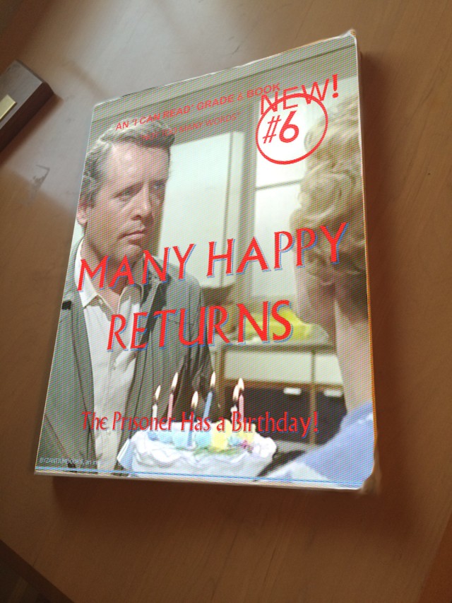
I made the basic image for this book in GIMP a few days ago, using a clip from the “Many Happy Returns” episode of The Prisoner (near the end). Most of the text I created in Word, converted to pdf, and opened as layers, positioned and sized, and anchored (or merged). I do this because I still haven’t figured out why GIMP doesn’t correctly display the Village font. The quote under the title refers to the ease of reading the text, as well as the lack of dialogue in the episode.
Once I made the book cover, I realized how flat it looked. It needed work to look more realistic. To get a more three-dimensional look, I took a photo of a handy book with mostly plain white cover (it was The Millennium Whole Earth Catalog) sitting on my desk. The angle allows a slight view of page edges, but I needed to adjust my image to fit on the book. It was easy enough with the Perspective tool, grabbing and moving the corners to match the corners of the underlying book. I then used the Smudge tool to rough up the edges just a little bit.
After all this, I thought the cover still looked too fresh and unused. So, I used the free select tool to isolate the book, and found under Effects->Distorts->Video the ability to make a surface of small dots, simulating a paperback cover printing process.
Overall, this was a good exercise in learning. Not only did I try some tools in GIMP, but I had to think about design. Of course, I used the Village font, but how about placement of the wording, cropping of the picture, etc? I had accidently left a blue line near the bottom (from my media player), but I took advantage of that to put a publisher’s name in the same color just above.
If I were to start over, I would not use a photo cover, but would go for a more minimalist look. But, if I remember right, TV shows and movies often had spin-off novelizations, and they often used photos from the original productions for the covers. It is a good marketing design (if not artistic) so the interested consumer identifies the tie-in.
By the way, no author is credited on the cover. It was probably written by a team of hack writers working from the original script, piece work, no royalties.


Oh – I think you did brilliant! The blue line – cosmic – great when chance plays into the design.
I also like your presentation on the desk. Very appropriate and fitting.
and don’t you love the way there are so many ways to make mashed potatoes! However you get there as long as it is good on the other end and the cook is happy!
“Cosmic” is a word that is in my mind a lot recently. “Fantasizing the cosmos,” to quote Scottlo quoting Bob Fass. Here at Prisoner106 we fantasize things that don’t exist and make them appear.
Bill!
Most excellent! It looks just like it’s a real book, sitting there waiting for me to read it!
It might have a lot of description, and perhaps a lot of internal monologue that Number Six clearly doesn’t speak in the episode, but yes, it is probably a bit thick for that one show.
Thanks for documenting your process so clearly. I’ve half a mind to follow your lead and do just this same process and see how it turns out for me.
Be seeing you!
I picture this big book with little dialogue as filled with maps, charts, journal pages, how-to-make things, and other activities. Lots of white space for writing and drawing. Maybe a perforated tear-out build-your-own raft. And six real candles with a recipe to make a birthday cake! Reading as part of the larger activity of learning.
Hi Bill, Great stuff, more gimpformation, bookmarked.
I love the detail top edge and the whole style.
The ‘I can’t read’ bit suggests high interest, low reading age, we always need more of these:-)
Thanks, John. The edges really gave me a bit of work. I used a combination of erasing to transparent and, once merged, smudging a little bit. It’s also interesting how the title text looks like a little offset of the color registration. I had used Word Art in Microsoft Word, selecting a bit of a drop shadow. The unintended result was better than I hoped for, since I chose the dotted screen later in the process. All good fun!
I had trouble with my Village font too. I ended up installing it again and that worked. Don’t know if you’ve tried that already.
You really captured the retro feel with your cover. The effects remind of of the Lurlene McDaniel books I used to read in middle school.
[…] behoove me create my own book cover, because I could benefit from experimenting with different effects and brushes and other tools available to master image […]